ornament · Sep 03, 2026
Why Ornament Lost an Argument
A short, one-sided case for why plain form won the workshop floor a century ago, and why the argument is worth re-running every time you reach for a flourish.
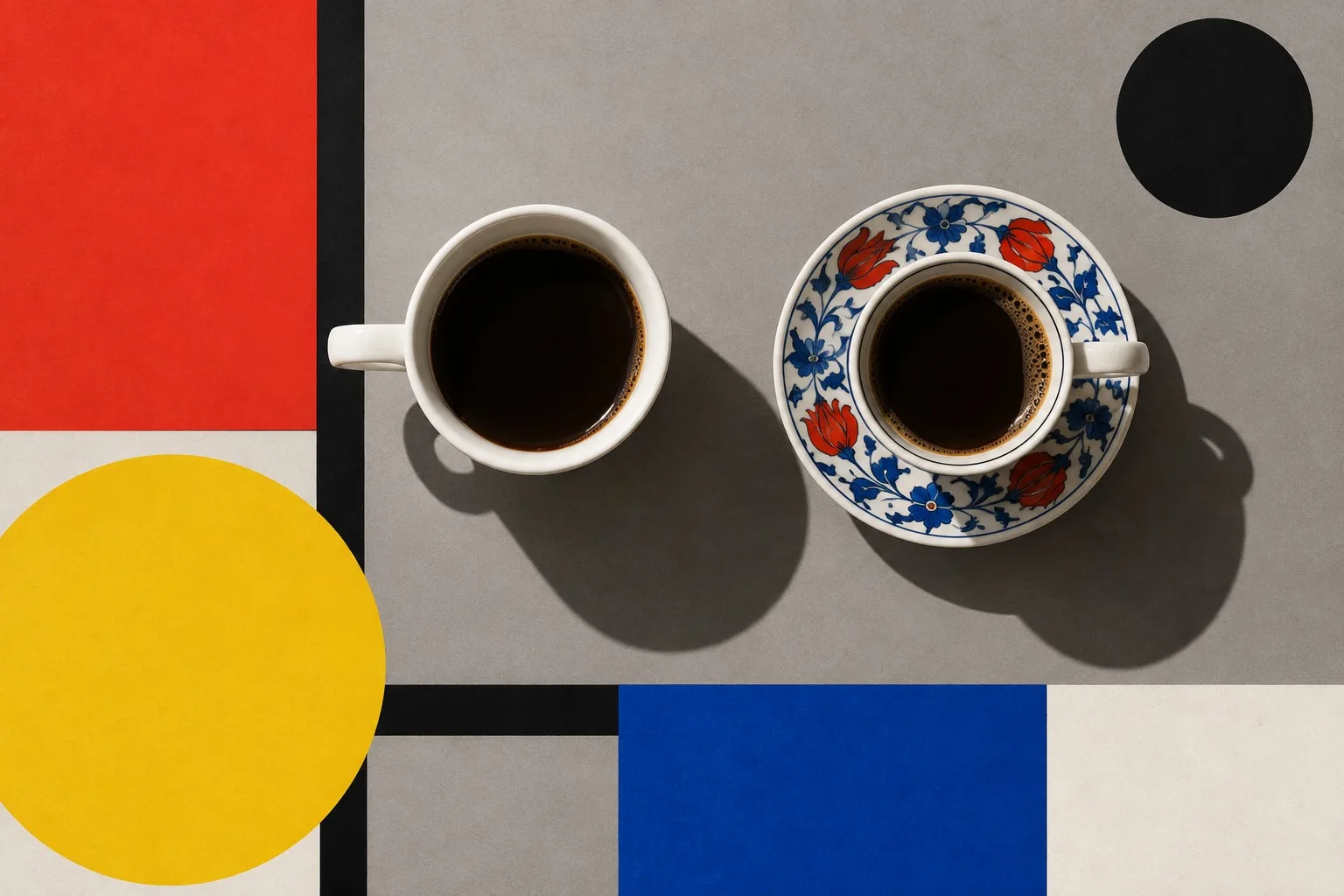
I should say up front that this is a teacher's argument and not a verdict of history. Historians will give you the complications. I will give you the version that fits on a blackboard.
Ornament did not lose because it was ugly. Plenty of it was lovely. It lost because it was a cost that nobody could justify any longer.
The accounting
Put yourself in a workshop around 1920. A chair can be plain or it can be carved. The carving takes a skilled person many hours. Those hours are paid for by whoever buys the chair, and they buy nothing that sits on, holds up or keeps out the rain. Meanwhile a machine can turn out the plain chair by the dozen.
You do not need a theory of beauty to see where that road goes. A plain object made well is cheaper, easier to repair and easier to clean. Ornament has to be better than all of that to win, and usually it is not.
The school that made it a doctrine
The Bauhaus was founded in Weimar in 1919, moved to Dessau in 1925, and was closed in 1933 under political pressure. Fourteen years. In that short time its workshops turned the plain-form instinct into a teaching method: start from use, choose the material honestly, let the shape follow.
As I read it, the point was never to ban decoration as a moral crime. The point was to make every mark earn its place. A stripe on a cup should be there for a reason, and the reason should be something you can say out loud.
What replaced it
Not nothing. This is the part students miss. When you remove the carved flourish you must put something else in charge, and what you put there is proportion, material, colour and the edge. A plain jug has a lot to get right. The curve of the lip, the thickness of the wall, the place where the handle meets the body. There is nowhere to hide a mistake.
That is why plain design is harder than ornate design. Ornament is camouflage. Take it away and the bones show.
The test for today
Every interface has its ornament. A shadow that adds no depth. A gradient on a button. An icon that repeats the word beside it. A welcome illustration that pushes the real content below the fold.
Ask the old question of each one: what does it do? If the answer is "it looks nice," you have found a flourish. If the answer is "it makes the hierarchy clearer," keep it, and notice that it was never ornament at all.
A fair objection
A student always raises a hand here. Surely people like ornament? They do. Nobody is asking you to stop being human. The claim is smaller and stricter: decoration should be chosen, not inherited. If you reach for a flourish, know why, and be ready to defend it to a sceptic with a pencil.
The sceptic is you, a week later. Be kind to that person and leave out the swirl. Then pick up a compass: typefaces are only geometry.
No comments yet
Comments are open. Have a thought or a question? Share it below.