typography · Sep 11, 2026
Typefaces Are Only Geometry
A circle, a square and a triangle will build most of the alphabet. Then the letters stop looking right, and that failure is where type design actually begins.
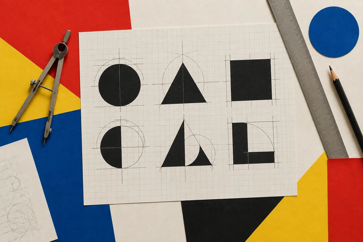
Hand a student a compass and a ruler and ask for the letter O. They draw a circle. Ask for A. Two diagonals and a bar. Ask for E and they give you a square with the right side missing.
Within ten minutes they have built half an alphabet, and they are grinning. I let them grin. Then I put their letters on the wall at the far end of the room and ask them to read a sentence.
What the circle gets wrong
The sentence is hard to read. The O looks small. The A looks heavy. The E looks like it has been dropped.
Nothing is wrong with the geometry. Something is wrong with the eye. Your eye does not measure; it judges. A perfect circle sitting on a baseline appears to sink, because it touches the line at a single point while a flat letter rests along an edge. So round letters have to overshoot the baseline and the cap height by a hair, which looks wrong on the drawing and right on the page.
Where the weight goes
Take the horizontal bar of an E. If it is the same thickness as the vertical stem, it will look heavier. Horizontals read thicker than verticals of equal width, so type designers thin them a little. The crossing of a diagonal and a stem creates a dark knot, so they notch it. The joint of an N gets cut away for air.
Every one of these corrections departs from the geometry in order to preserve its spirit. The letter has to look as if it were built from a perfect shape, while quietly not being one.
The three shapes still matter
I do not tell students to give up the compass. I tell them to start with it and learn exactly where it lies.
The circle governs the O, C, G, Q and the bowls of the b, d, p and q. Its job is openness and speed.
The square governs the E, F, H, L and the corner turns of M and N. Its job is stability.
The triangle governs the A, V, W and the heart of the K and the X. Its job is direction.
A good type family is a negotiation among those three, and the best ones let you feel the negotiation without being able to point to it.
An exercise
Choose one word of five letters. Build it first from pure geometry, with a compass and a ruler, no corrections. Print it large. Then set the same word in a typeface you admire, at the same height, and lay the two over each other on a light table.
The gaps between your version and the professional one are the lessons. Mark each with a red pencil: here the bowl swells, here the stem thins, here the foot is trimmed. By the end the page will be red with the corrections, and you will never again believe that a typeface is just geometry.
Which is the point. Rules are what you hold in your hand so you know how far you have strayed. Next, a worked assignment using only three of them: the three-shape exercise.
No comments yet
Comments are open. Have a thought or a question? Share it below.