colour · Aug 18, 2026
Primary Colour in Interface Design
Red, yellow, blue, black and white. A design teacher explains why the first palette a student gets is the smallest one, and what each colour is allowed to do.
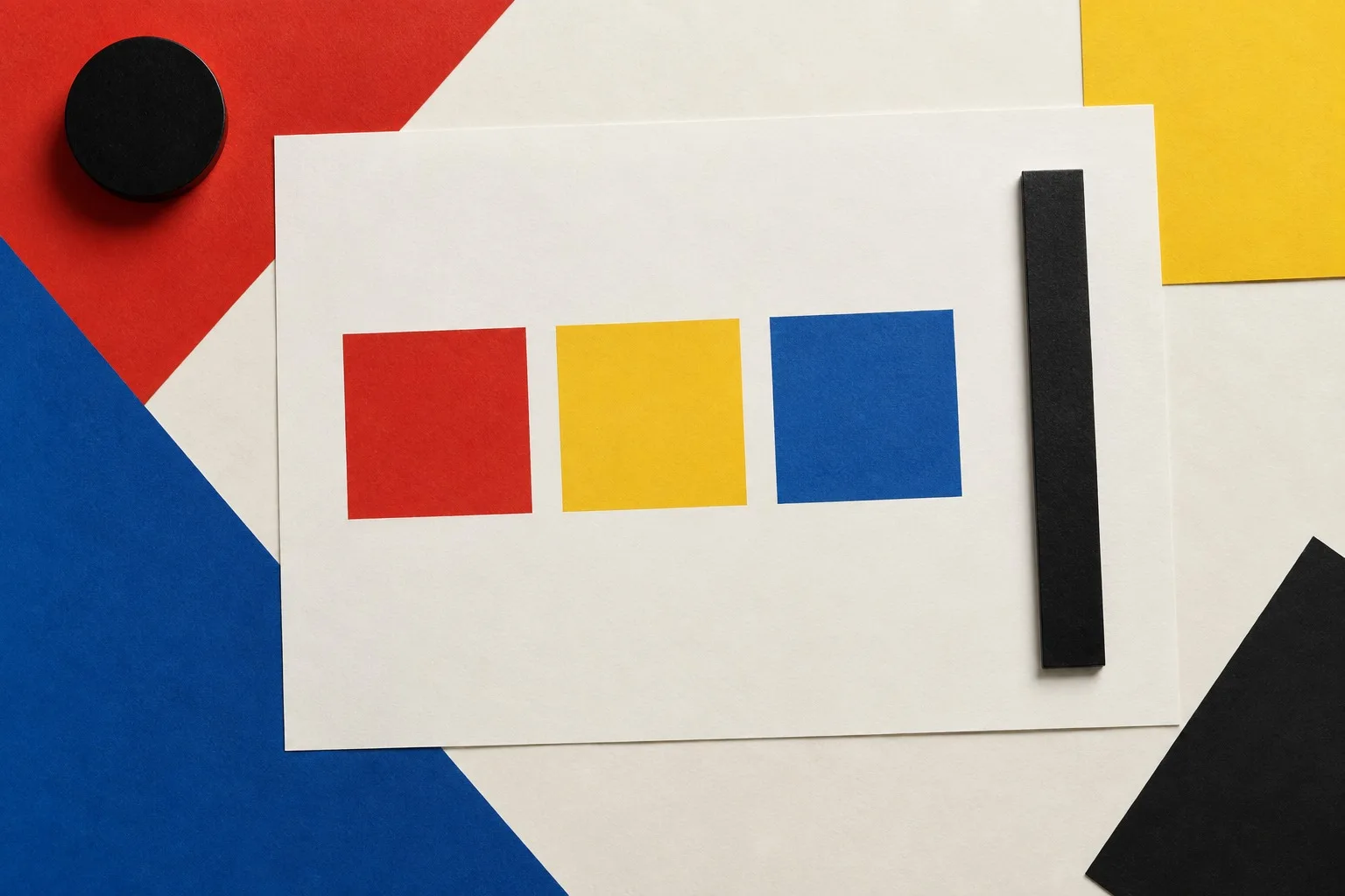
Red. Yellow. Blue. Black, white, and one grey if you must.
That is the whole palette I hand to first-year students, and every autumn someone asks whether it is a joke. It is not. The constraint is the lesson. Give a beginner sixteen million colours and they will use eleven million of them by Friday, and not one will mean anything.
One colour, one job
A colour on a screen has a job to do. If it has no job, remove it.
Red means stop, or look here now: an error, a destructive action, a recording light. Yellow means care. It marks what you might want to notice and what might go wrong. Blue is the quiet colour. It is for links, for selection, for information that waits patiently to be read. Black and white carry the text and the ground.
Four jobs, four colours. When a fifth job arrives, resist the fifth colour. Ask first whether the job is real. Nine times out of ten it is a decoration that has been promoted.
The test I set
Take any interface you use daily. Open it. Now cover everything that is not red, yellow, blue, black or white. What is left?
Usually the answer is: almost nothing. A teal button, a purple badge, an orange banner, a lime progress bar, each one added in a different month by a different person who needed to be noticed. The screen has become a crowd. Nobody in a crowd can be heard.
Now do the reverse. Take your best-loved interface and strip it to the primaries. If it still works, the design lives in the structure. If it falls apart, the colour was holding up a weak layout, and you have just learned something expensive for free.
Contrast is not optional
A pure primary on a pure ground can vibrate or vanish. Yellow text on white is the classic crime. The numbers exist so that we do not argue about it: the web accessibility guidelines ask for a contrast ratio of at least 4.5 to 1 for normal body text at level AA. Measure it. Do not judge it by eye at the end of a long day.
The remedy is not to abandon the primaries but to use them where they are strong. Yellow works best as a ground, with black text on top of it. Blue and red work best as fields, with white text. Treat each hue as a surface first and a stroke second.
Flat, on purpose
Gradients and glows are a way of apologising for a shape. A flat field of colour says: this is a rectangle, it is blue, it is a button. There is no apology in it. The edge of the field is the edge of the thing. You can see where to click without being told.
I tell students to hold the edge firmly. A hard-edged blue square with a white label is a complete piece of design. Everything else is a negotiation about whether you trust it.
Homework
Redesign one screen of an app you dislike, using three hues and nothing else. Print it. Pin it to the wall. Defend, out loud, every colour you kept.
The silence in the room while a student explains why the error is red is the best sound I know. Next week we build the grid that holds these colours in place: a grid from a single square.
No comments yet
Comments are open. Have a thought or a question? Share it below.