grid · Aug 26, 2026
Building a Grid from a Square
Every layout I trust started as one square. Divide it, fix the gutter, and the page is already decided. A method in six steps, with the arithmetic shown.
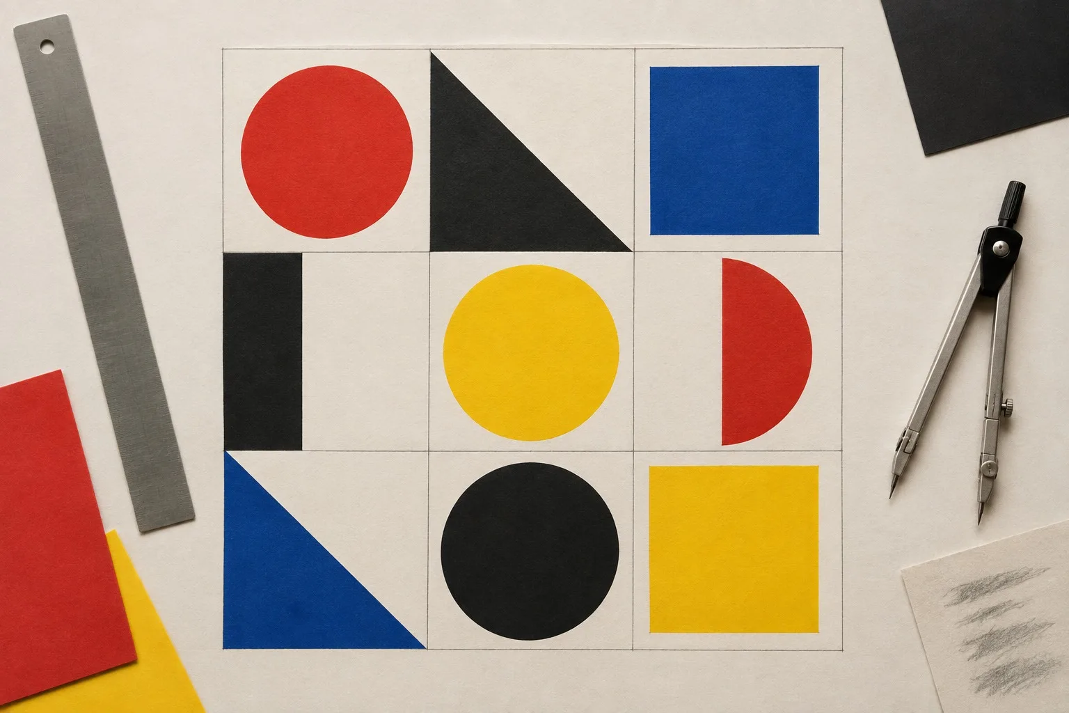
Draw a square. Make it large, bigger than feels reasonable. This is your page.
Most layouts that fail were never given a square to begin with. They began as a vague rectangle and a feeling. A grid is the opposite of a feeling. It is a decision made once, early, so that you do not have to make it two hundred times later.
The method
Here is the order I teach. Do not skip a step, and do not reorder them.
Draw the square and call its side 1.
Divide it in half both ways. You now have four equal squares.
Divide each of those by six. You have a twelve-by-twelve field, and twelve is the most useful number a designer owns, because it splits into halves, thirds, quarters and sixths.
Choose one gutter. One. It is the same everywhere, vertical and horizontal, and it is never an accident.
Choose the margin. A good default is two gutters on the sides and three at the foot, so the content sits a little above the middle of the sheet.
Place things only on lines. Nothing floats.
Why twelve
Because it is generous without being vague. Two columns of six, three of four, four of three, six of two. A headline can span nine and a caption can take three. You never have to round a number, and rounding is where grids go to die.
If you prefer a square of five or a field of eight, fine. The principle is the same: pick a number with plenty of divisors and stay loyal to it.
The gutter is the grammar
The space between modules does more than separate. It sets the rhythm. A tight gutter reads as a block, almost a wall. A wide gutter reads as a row of separate statements. Neither is correct. What matters is that the gutter is the same everywhere, so the eye learns it in the first second and stops noticing it.
When a student's layout feels restless, I look at the gaps first. There are nearly always three different ones.
A worked example
Say the square is 480 units across. Divided into twelve, each module is 40 units. Choose a gutter of 8, so each module is really a 32-unit box with a gap beside it. A photograph that spans four modules is 32 plus 8 plus 32 plus 8 plus 32 plus 8 plus 32, which is 152 units with the gutters inside it. The caption beneath takes three modules and sits flush to the left edge of the photograph.
Nothing in that was a guess. If you can say how wide a thing is, you can say where it goes.
When to break it
Break the grid on purpose, once, and make it obvious. One image bleeding to the edge of the sheet can hold a whole spread together, because the eye understands the rule by seeing the exception. Break it twice and you no longer have a rule, only a mess with a history.
Next, the reason we stopped decorating the corners: why ornament lost the argument.
No comments yet
Comments are open. Have a thought or a question? Share it below.