poster · Sep 29, 2026
Anatomy of a Poster: Open Workshop Day
One poster for an invented open day, taken apart with eight numbered annotations. Where each shape sits, why the red is where it is, and what I would change.
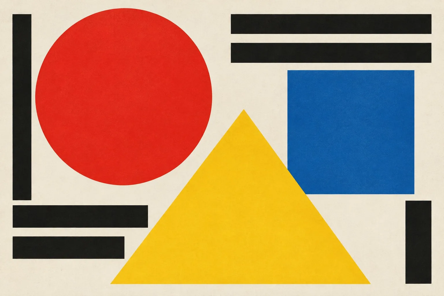
This is the poster we made for the Open Workshop Day at Kiln Street Workshop, an invented event for the purposes of this lesson. It is portrait, one metre by seventy centimetres, printed in flat red, yellow and blue, with black type, on white. Read the annotations in order and keep the picture in your head. I will name each shape and say what it is doing.
The sheet
The page is divided into a grid of twelve rows and eight columns, with a gutter equal to one-tenth of a module. Everything on the poster is placed on a line of that grid. If you hold a ruler against it, nothing is a millimetre off.
Hierarchy is simple: one large shape, two supporting shapes, one block of text. The eye lands on the big one, travels to the second, rests on the third, and then falls to the date.
The annotations
The red circle. Upper left, eight modules across, cropped by the left edge of the sheet. It is the hero, and it is red because it is the loudest job on the poster: come here. Cropping it makes it feel as if it is rolling in from outside.
The blue square. Lower right, four modules, sitting exactly one module below the circle's lowest point. It is the quiet job, the information. The square is stable, so the details rest on it.
The yellow triangle. Pointing up, three modules wide, wedged between the circle and the square. It is the warning and the arrow: this way. Its apex sits on the baseline of the title.
The overlap. Where the triangle crosses the circle, the colour does not mix. The triangle simply wins. I chose this on purpose; it shows who has priority.
The title. Open Workshop Day, set in black, flush left, in three lines. The type is large enough to read from across a street. The first letter of each line aligns to the same grid line.
The date. Smaller, set in white on the blue square. High contrast, one line, no decoration.
The empty space. Upper right and lower left stay white. It is not a gap; it is the pause that lets the shapes breathe.
The margin. Three gutters at the foot, two at the sides. The whole composition sits slightly above centre.
What I would change
Honesty, because I will ask the same of you. The yellow triangle is a touch too small. Next to the large circle it reads as a stray piece. If I made this again I would grow it by a module and let its point break the margin, so it became a clear arrow instead of a wedge.
I would also try the title in two lines, not three. Three lines make the left edge heavy.
Try it
Take the poster you made in the three-shape exercise and write eight annotations for it, in numbers, as I have here. If you cannot find eight things worth saying, the poster has a gap in it. If you find twenty, it has too many ideas.
Either way, you will have learned to read your own work the way a stranger does, which is the whole of the craft. For the plain theory behind the method, start again at primary colour.
No comments yet
Comments are open. Have a thought or a question? Share it below.